Quality Control: Difference between revisions
m add link to scanlation tools for hyphenation |
No edit summary |
||
| (4 intermediate revisions by the same user not shown) | |||
| Line 12: | Line 12: | ||
| Vertical ellipsis | | Vertical ellipsis | ||
| [[File:Vertical ellipses.webp|x100px]] | | [[File:Vertical ellipses.webp|x100px]] | ||
Should be made horizontal. | |||
|- | |||
| Vertical scribble lines | |||
| [[File:Vertical scribble lines.webp|x100px]] | |||
Should be made horizontal. Can be redawn manually, or using a font like [https://fonts.google.com/specimen/Redacted+Script Redacted Script]. | |||
|- | |- | ||
| Typos (commonly, incorrectly-doubled letters in words like “embarrassed”) | | Typos (commonly, incorrectly-doubled letters in words like “embarrassed”) | ||
| Line 69: | Line 76: | ||
| Hyphen at the start of the line | | Hyphen at the start of the line | ||
| [[File:Next-line hyphen.webp|x100px]] | | [[File:Next-line hyphen.webp|x100px]] | ||
In English, hyphens always go at the end of the line. | |||
|- | |- | ||
| Wrong hyphenation points | | Wrong hyphenation points | ||
| Line 76: | Line 85: | ||
|- | |- | ||
| Two-dot, four-dot, etc ellipsis; ellipses should be in multiples of three | | Two-dot, four-dot, etc ellipsis; ellipses should be in multiples of three | ||
This still applies to ellipses before a question or exclamation mark; that is, use “…?” and not “..?”. | |||
| [[File:Four-dot ellipses.webp|x100px]] | | [[File:Four-dot ellipses.webp|x100px]] | ||
| Line 102: | Line 113: | ||
[[File:Space before ellipsis.webp|x100px]] | [[File:Space before ellipsis.webp|x100px]] | ||
Ellipses have a space after them at the end and in the middle of sentences, and a space before them at the start of sentences. | |||
|- | |- | ||
| Capitalization at the start of bubbles, when it continues a sentence | | Capitalization at the start of bubbles, when it continues a sentence | ||
| Line 217: | Line 230: | ||
Did she really extend her hand and crack it? | Did she really extend her hand and crack it? | ||
|- | |||
| Overused SFX | |||
| “fwip” | |||
|- | |- | ||
| Bad/unnatural wording | | Bad/unnatural wording | ||
Latest revision as of 17:50, 2 June 2025
Quality control, often abbreviated to QC, is the process of reading through a fully-typeset manga (ideally, alongside the raws) to point out mistakes and areas of improvement. It is also known as proofreading (PR), but this term may also refer to reading over the script prior to cleaning and typesetting.
Quality control should a collaborative process between the typesetter and QCer; there are often many rounds of back-and-forth before the best approach is decided upon.
This page collects a number of common issues that QCers will raise, and where appropriate gives examples. Not all of these represent mistakes; sometimes, the author will have done something odd, or it’s an intentional stylistic choice.
Typesetting issues[edit]
| Issue | Examples |
|---|---|
| Vertical ellipsis | 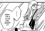
Should be made horizontal. |
| Vertical scribble lines | 
Should be made horizontal. Can be redawn manually, or using a font like Redacted Script. |
| Typos (commonly, incorrectly-doubled letters in words like “embarrassed”) | |
| Inconsistent line spacing | 
|
| Line spacing too small or too large | Too small: 
|
| Text not centre-aligned (this isn’t always bad; just follow the shape of the bubble) | 
|
| Text not centred | 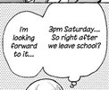
|
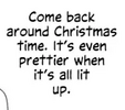
| Bad shaping (though one often must sacrifice either shaping or readability if hyphenation is necessary, so this can be a tradeoff; rewording the sentence is the ideal solution) | 
Should probably move “Yeah,” to the line above Should move “up.” to the previous line to avoid a triangular text shape Should move “I” to the previous line to make a nicer text shape |
| Hyphenating a non-compound word (not incorrect, but ideally one would reword the sentence so that both shaping and readability are preserved) | 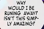
In this case, substituting “simply” with “just” removes the hyphen while preserving meaning and shaping. Sometimes more complicated rewrites are necessary. |
| Hanging punctuation | 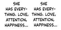
The left paragraph is what one would get by typing out the text normally; the right paragraph uses hanging punctuation, which means that ellipses and hyphens are not taken into account when centring each line (this can be achieved by inserting invisible characters at the start of the line). Their use is a matter of style; some think is looks better, others thinks it looks worse. |
| Incorrect crossbar I – crossbar I should only be used when the letter stands alone, which includes the personal pronoun (“I”, “I’m”, “I’ll”) and (depending on stylistic choice) acronyms. | 
Should have followed Automatic Crossbar I’s advice. |
| Missing crossbar I (assuming that the font has it) | 
|
| Not using different fonts for different JA fonts (incl. thoughts); this isn’t always bad, and one should exercise judgement to make a result that’s not too plain and not too cluttered | 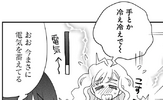 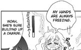
|
| Next-line punctuation, e.g. ellipsis, exclamation mark or question mark (can be a lesser of two evils) | 
|
| Hyphen at the start of the line | 
In English, hyphens always go at the end of the line. |
| Wrong hyphenation points | 
“Person” is hyphenated as “per•son”. The scanlation tools site has a utility to help find correct hyphenation points (in the left sidebar). |
| Two-dot, four-dot, etc ellipsis; ellipses should be in multiples of three
This still applies to ellipses before a question or exclamation mark; that is, use “…?” and not “..?”. |

|
| Missing punctuation at end of sentence | 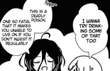
|
| Non-comic font used, “chopsticks” font used (e.g. Manga Temple) or Comic Sans used |   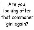
|
| Using different fonts for different characters | |
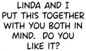
| Stray space | 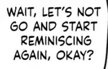
A stray space before “reminiscing” Double space after “mind.” |
| Wrong spacing around punctuation, often ellipses | 
Ellipses have a space after them at the end and in the middle of sentences, and a space before them at the start of sentences. |
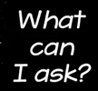
| Capitalization at the start of bubbles, when it continues a sentence | 
|
| No capitalization at the start of a sentence | 
|
| Not enough white border around SFX | |
| Font aspect ratio is messed with | 
|
| Clashing ascenders and descenders, and other spacing oddities from the font | 
Here, the “j” on the first line clashes with the “h” on the second line, and the “y” on the fifth line clashes with the “l” below it. This can be resolved by switching fonts, increasing line spacing, or adjusting letter spacing manually. Additionally, even though the text is correct, the font makes the space after the dash look larger than other spaces, which should be fixed similarly. |
| Font glyph needs replacement – sometimes, a font will have a particularly bad glyph and it’s desirable to replace that glyph in particular. Of course, this must be done consistently; one may wish to edit the font itself using a tool like FontForge to that effect. | 
The “z” in this font is very large and may warrant replacing. The apostrophe in this font is weirdly low and may warrant replacing. |
| Bad perspective transform | 
|
| Text too close to edge of bubble | 
|
| Text is off-black (or off-white) | |
| Bubbles too thin (should have redrawn bubble) | |
| Text rotated 90° | |
| Empty bubble (sometimes intentional on the author’s part, but should not be introduced in a translation) | |
| Missing SFX | |
| Inconsistent capitalization and punctuation of side text | |
| Obscured text missing a half-covered letter | |
| “Penrose stairs” layering: when text is above one part of the art but below another in an inconsistent way | 
|
| Mismatched repetition | |
| Mismatched flashback text | 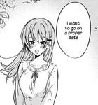
|
| Abrupt cutoff that uses an ellipsis (instead of a dash) | |
| Text split over multiple bubbles (this can be a lesser of two evils, especially when one is unwilling to redraw the bubble entirely) | 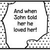
|
| Inconsistent use of directional vs non-directional apostrophe | 
|
| Aliased or blurry text | 
|
| Overuse of cliché fonts like Wild Words; the font itself isn’t bad, but one can do much better | 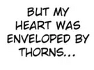
|
| Sound effects in speech – these can be written in plain text, but may also use breath marks, italic or bold-italic | An example of breath marks, a.k.a. cat whiskers, fireflies or crow’s feet:
Use on words like “Whew”, “Sigh”, “Grunt”, “Cough”, etc |
Translation issues[edit]
Grammatical mistakes should be pointed out, but can be introduced for spoken emphasis.
| Issue | Examples |
|---|---|
| Untranslated SFX: “Doki”, “Go”, etc | 
“Doki doki” can be translated as “th-thump”, “ba-dump”, “bdmp”, etc |
| Nonsensical SFX | 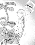
The SFX is a speech bubble from the chair, so it should be a noise the chair makes, like “creak”. Did she really extend her hand and crack it? |
| Overused SFX | “fwip” |
| Bad/unnatural wording | |
| Incorrectly added hyphenated phrase | “The most-popular flavour is” |
| Incorrectly not added hyphenated phrase | “first year” should be “first-year” |
| Apostophes and “s”s | “Girl’s school” should be “Girls’ school”, “Parent’s evening” should be “Parents’ evening” |
| Missing comma | “It’s not like I’m mad at you Akizuki-san.”, “Oh no not with that girl…” |
| Extra comma | “I think, it’s a good idea” |
| Contraction not used in speech (often subjective) | “You are” → “you’re”, “I am” → “I’m” |
| Phrase that is close to, but not exactly, an English idiom |
|
| Inconsistent spelling dialect | “ize” versus “ise” endings; “Mum” versus “Mom”; “color” versus “colour”; etc |
| Inconsistently-spaced compound phrases (in the case where both are grammatically correct) | “photoshoot” versus “photo shoot” |
| Missing space in words that are sometimes compound | |
| Wrong extended letter; in general, one should elongate the vowel that is stressed in English | “grabbbbeeeeed” → “graaaaabbed”, “pleaaaase” → “pleeeease”, “Stop ittttt!” → “Stop iiiiiit!” |
| Letter extend to two letters long – always use at least three | “graabbed”, “pleease”, “Stop iit!” |
| En dashes should be used to hyphenate phrases that have spaces | Correct examples include “red bean paste–filled bun”, “Cold War–era” |
| Capitalization of words that are both normal and proper nouns: | “to my Dad” → “to my dad”, “to dad” → “to Dad” |
| Inconsistent tense | |
| Inconsistent 3rd person vs 2nd person | 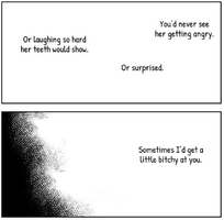
|
| Stock phrases (to be used in moderation) | “that person”, “pinch”, “even if you tell me that”, “say unnecessary things”, “killing intent”; see also this spreadsheet of stock phrases |
| Overuse of Japanese sounds | “Kya”, “Eehh” |
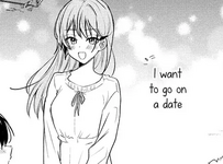
| Overuse of Japanese punctuation like tildes and ellipses-exclamation marks | “Oh no~”, “No way…!” |
| Overuse of ◯◯ or XX or similar, instead of rewording | “You wanted to go to ◯◯ High School, didn’t you?” → “You wanted to go to that high school, didn’t you?” |
| Inline TL notes; prefer folding them into the text, or adding notes at the end | |
| Questions (including rhetorical) without question marks |
Redrawing issues[edit]
| Issue | Examples |
|---|---|
| Lines connected incorrectly |  
|
| Screentone wrong shade | 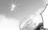
Can be avoided by using high-contrast filters. |
| Screentone misaligned | 
|
| Screentone too blurry or sharp | 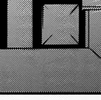
|
| Redrawing using wrong colour | 
The circled region is pure black, while the region around is slightly brown. Using a filter mask to increase contrast can help spot this kind of issue. An instance where cleaning was performed with a bluish-black colour instead of real black. |
| Missed cleaning speck | 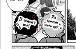
|
| Lines connected that were intentionally split in the raw | |
| Missing redraw | |
| Lines too blurry or sharp | See Controlling hardness. |
| No levelling: Black is off-black, white is off-white | See Color Calibration. |

