Quality Control
Quality control, often abbreviated to QC, is the process of reading through a fully-typeset manga (ideally, alongside the raws) to point out mistakes and areas of improvement. It is also known as proofreading (PR), but this term may also refer to reading over the script prior to cleaning and typesetting.
Quality control should a collaborative process between the typesetter and QCer; there are often many rounds of back-and-forth before the best approach is decided upon.
This page collects a number of common issues that QCers will raise, and where appropriate gives examples. Not all of these represent mistakes; sometimes, the author will have done something odd, or it’s an intentional stylistic choice.
Typesetting issues
Translation issues
Grammatical mistakes should be pointed out, but can be introduced for spoken emphasis.
| Issue | Examples |
|---|---|
| Untranslated SFX: “Doki”, “Go”, etc | 
“Doki doki” can be translated as “th-thump”, “ba-dump”, “bdmp”, etc |
| Nonsensical SFX | 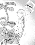
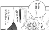
The SFX is a speech bubble from the chair, so it should be a noise the chair makes, like “creak”. Did she really extend her hand and crack it? |
| Bad/unnatural wording | |
| Incorrectly added hyphenated phrase | “The most-popular flavour is” |
| Incorrectly not added hyphenated phrase | “first year” should be “first-year” |
| Apostophes and “s”s | “Girl’s school” should be “Girls’ school”, “Parent’s evening” should be “Parents’ evening” |
| Missing comma | “It’s not like I’m mad at you Akizuki-san.”, “Oh no not with that girl…” |
| Extra comma | “I think, it’s a good idea” |
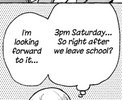
| Contraction not used in speech (often subjective) | “You are” → “you’re”, “I am” → “I’m” |
| Phrase that is close to, but not exactly, an English idiom |
|
| Inconsistent spelling dialect | “ize” versus “ise” endings; “Mum” versus “Mom”; “color” versus “colour”; etc |
| Inconsistently-spaced compound phrases (in the case where both are grammatically correct) | “photoshoot” versus “photo shoot” |
| Missing space in words that are sometimes compound | |
| Wrong extended letter; in general, one should elongate the vowel that is stressed in English | “grabbbbeeeeed” → “graaaaabbed”, “pleaaaase” → “pleeeease”, “Stop ittttt!” → “Stop iiiiiit!” |
| Letter extend to two letters long – always use at least three | “graabed”, “pleease”, “Stop iit!” |
| En dashes should be used to hyphenate phrases that have spaces | Correct examples include “red bean paste–filled bun”, “Cold War–era” |
| Capitalization of words that are both normal and proper nouns: | “to my Dad” → “to my dad”, “to dad” → “to Dad” |
| Inconsistent tense | |
| Inconsistent 3rd person vs 2nd person | 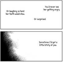
|
| Stock phrases (to be used in moderation) | “that person”, “pinch”, “even if you tell me that”, “say unnecessary things”, “killing intent”; see also this spreadsheet of stock phrases |
| Overuse of Japanese sounds | “Kya”, “Eehh” |
| Overuse of Japanese punctuation like tildes and ellipses-exclamation marks | “Oh no~”, “No way…!” |
| Overuse of ◯◯ or XX or similar, instead of rewording | “You wanted to go to ◯◯ High School, didn’t you?” → “You wanted to go to that high school, didn’t you?” |
| Inline TL notes; prefer folding them into the text, or adding notes at the end | |
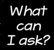
| Questions (including rhetorical) without question marks |

